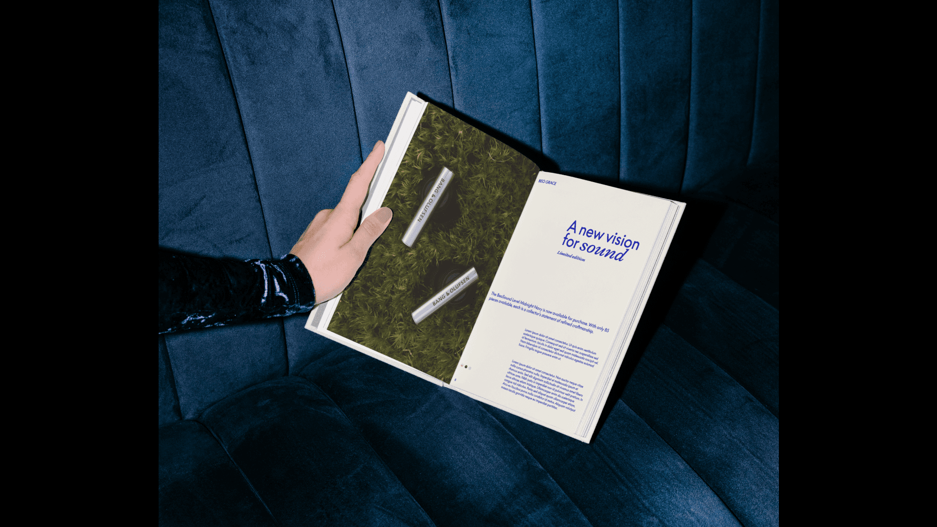
A new vision for sound
Bang & Olufsen
A new vision for sound
Bang & Olufsen
(Services)
(Services)
Branding
Branding
,
,
Art Direction
Art Direction
,
,
Packaging
Packaging
(Industry)
(Industry)
Luxury audio
Luxury audio
(Year)
(Year)
2025
2025
(Information)
(Information)
This project explores a new visual identity direction for Bang & Olufsen, building on the brand’s heritage while reasserting its relevance in a contemporary cultural context.
Rather than reinventing the brand, the work focuses on refinement: strengthening typographic presence, redefining the role of colour, and introducing a more expressive editorial framework that allows the brand to speak with confidence across touchpoints.
(Information)
(Information)
Bang & Olufsen has always balanced engineering precision with emotional resonance. The challenge was to translate this duality into a visual language that feels timeless yet assertive, luxurious yet approachable.
The system is designed to:
elevate presence without visual excess
allow emotion without losing control
create consistency while enabling variation
Every element is treated as part of a composed whole, rather than a collection of decorative assets.


(Information)
(Information)
Typography plays a central role in the identity.
Bold, confident typographic statements establish authority, while refined serif accents introduce softness and nuance. The contrast between typographic voices allows layouts to shift between editorial calm and graphic impact without breaking cohesion.
Scale, spacing, and alignment are used deliberately, turning type into a structural element rather than a purely communicative one.
(Information)
(Information)
Colour is treated as both an emotional and structural device.
Neutral tones create space and stillness, allowing imagery and products to breathe. Saturated accent colours are introduced sparingly, acting as moments of emphasis rather than constant presence.
Each layout is carefully balanced, with colour guiding hierarchy, framing content, and shaping rhythm.


(Information)
(Information)
Strong margins, clear grids, and intentional asymmetry create compositions that feel curated rather than rigid. Editorial layouts allow imagery, typography, and whitespace to interact dynamically, reinforcing the brand’s cultural and artistic positioning.
The system supports both high-impact statements and quieter, more contemplative moments — reflecting the experience of sound itself.


(Information)
(Information)
Shared principles around typography, colour usage, hierarchy, and layout were defined to support consistency without constraining each platform’s specific needs.
In parallel, the system was extended with the retail team to inform event and in-store communication guidelines. This phase focused on adapting the identity to physical spaces and experiential moments, ensuring the visual language could operate clearly beyond digital environments.

More Projects


Let’s create Something Together

Let’s create Something Together
Let’s create Something Together