Side hustle made easy
COMOD
Side hustle made easy
COMOD
(Services)
(Services)
Web Design
Web Design
,
,
Branding
Branding
,
,
Creative Strategy
Creative Strategy
(Industry)
(Industry)
Marketplace
Marketplace
(Year)
(Year)
2025
2025
(Information)
(Information)
COMOD is a digital platform designed to simplify the relationship between employers and workers in shift-based industries. The project spans a responsive website for employers and a mobile app for workers, focusing on clarity, efficiency, and trust across every interaction.
The challenge was to design two distinct experiences for different user needs, while maintaining a consistent product language and visual identity.
(Information)
(Information)
Employers need structure, overview, and control.
Workers need speed, clarity, and confidence.
The product had to support:
high-frequency actions
time-sensitive decisions
legally and financially meaningful steps
All without overwhelming users or creating friction in critical moments such as hiring, scheduling, and approval flows.

(Information)
(Information)
The UX approach was grounded in task clarity and role separation.
Rather than forcing a single experience, the platform was intentionally split into two tailored environments:
a web-based dashboard for employers
a mobile-first app for workers
Each interface prioritises what matters most to its user, while sharing the same underlying logic and system structure.
Complex actions are broken into clear, sequential steps, reducing cognitive load and minimising room for error.


(Information)
(Information)
The employer experience focuses on overview and decision-making. Visual density is carefully controlled to allow employers to manage multiple workers and timeframes without losing context.
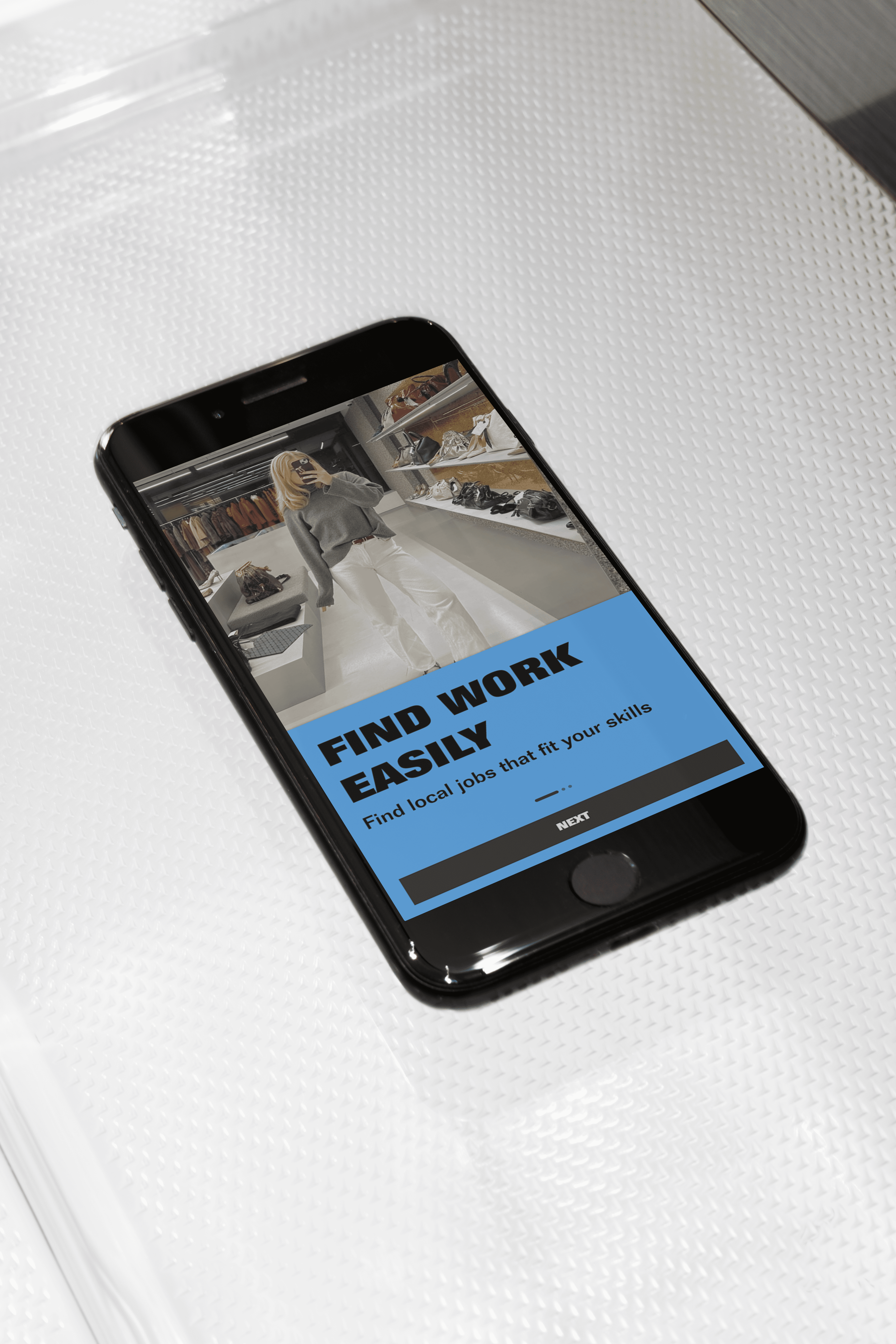
The worker app is designed for speed and immediacy. The experience avoids unnecessary layers, allowing workers to understand what is expected of them and what happens next — from applying for a shift to submitting worked hours for approval. Tone and interaction design aim to feel friendly and supportive.
The employer experience focuses on overview and decision-making. Visual density is carefully controlled to allow employers to manage multiple workers and timeframes without losing context.
The worker app is designed for speed and immediacy. The experience avoids unnecessary layers, allowing workers to understand what is expected of them and what happens next — from applying for a shift to submitting worked hours for approval. Tone and interaction design aim to feel friendly and supportive.

(Information)
(Information)
The visual language of COMOD is deliberately bold and unapologetic, designed to stand out in a category often dominated by neutral, invisible interfaces. Large colour fields, high-contrast typography, and graphic repetition are used to create a strong sense of identity and recognition across both the employer website and the worker app. Colour functions as both navigation and attitude. The art direction embraces visibility and confidence, reflecting the social and public nature of the work being facilitated: shifts, events, people, and real-world interactions. Interfaces are clean and structured, but never anonymous. Content is framed boldly, allowing imagery, listings, and calls to action to feel immediate and direct.
COMOD is not “calm SaaS”. It’s confident, graphic, and socially visible.
Visually loud, assertive, and opinionated, and the copy needs to own that instead of downplaying it.

More Projects


Let’s create Something Together

Let’s create Something Together
Let’s create Something Together